ShopDreamUp AI ArtDreamUp
Deviation Actions


Suggested Deviants


Suggested Collections


You Might Like…


Featured in Groups


Description
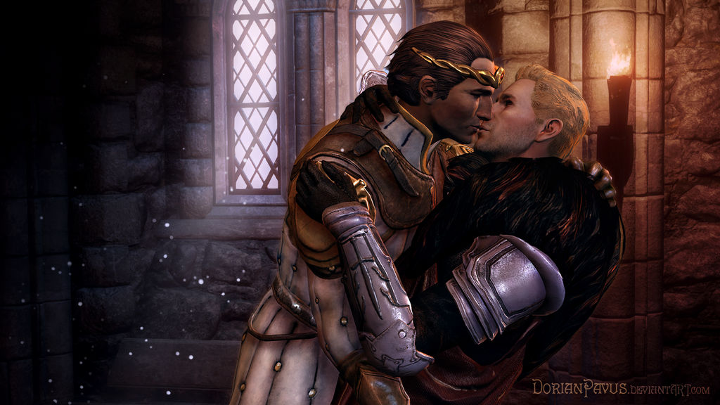
I actually wanted to go with different colors, but it's okay how it turned out now.
It's the first image I made with my new monitor settings!
How does it look? Are the colors better?
I was pretty annoyed with this piece before it started looking good, more because of my tablet not working and being unsure of the colors now than the image itself.
I desperately wanted to improve, too, and get a step further in my artistic development, and if it's not very obvious that this is happening, I get frustrated.
The last two or three hours of working on it were fun, though, because it finally looked good after I added the shadows.
I'd be grateful for any constructive criticism!
Please tell me what you think worked here and what you liked,
what you disliked and how the latter could be redeemed! (Smile)")
Also, do you want some more romantic wallpapers?
 More:
More:
------------------ CREDITS -------------------
Cullen Stanton Rutherford ported by Padme4000
Prince of Starkhaven Sebastian Vael ported by Berserker79
 -------------- DISCLAIMER --------------
Dragon Age: Inquisition and Dragon Age: Origins belong to Bioware and EA.
Artwork for entertainment purposes only. No copyright infringement intended.
It's the first image I made with my new monitor settings!
How does it look? Are the colors better?
I was pretty annoyed with this piece before it started looking good, more because of my tablet not working and being unsure of the colors now than the image itself.
I desperately wanted to improve, too, and get a step further in my artistic development, and if it's not very obvious that this is happening, I get frustrated.
The last two or three hours of working on it were fun, though, because it finally looked good after I added the shadows.
I'd be grateful for any constructive criticism!
Please tell me what you think worked here and what you liked,
what you disliked and how the latter could be redeemed!
Also, do you want some more romantic wallpapers?
More: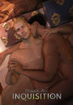
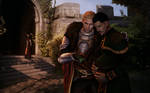
------------------
Cullen Stanton Rutherford ported by Padme4000
Prince of Starkhaven Sebastian Vael ported by Berserker79
-------------- DISCLAIMER -------------- Dragon Age: Inquisition and Dragon Age: Origins belong to Bioware and EA.
Artwork for entertainment purposes only. No copyright infringement intended.
Image size
1600x900px 2.29 MB
© 2016 - 2024 RainbowRenders
Comments3
Join the community to add your comment. Already a deviant? Log In
Overall I really like this piece. From what I get from it is that Cullen and Sebastian snuck away to have a few minutes of romance with each other before going back to work. That's what I see in my mind that leads up to this moment. As for my critique I feel like the area close to the window is a little bit to dark for me. I feel like there should be a little more. Since you have that amount of light coming through the window I think that it should be a little more lighter. Or maybe put more of the floating "firefly" lights in that area of the room.
That's the only critique I have.
Keep up the good work & don't let those haters get to you :3